Flexbox gap workaround for Safari on iOS 14, 13 and lower
How to create a correct CSS @supports at-role to eliminate visual inconsistencies between browsers
tl;dr:
@supports (-webkit-touch-callout: none) and (not(translate: none))
Since working on a commercial project almost always means having to support at least the previous version of each browser available, some surprises might always occur when inspecting the way your project works for older versions.
Unless you’re purposefully avoiding adjusting the layouts for mobile clients, which might hurt your business, considering around 50% of worldwide website traffic nowadays comes from mobile devices, you’ll quickly run into problems related to styling mobile Safari below 14.1 (iOS below 14.5).
Some problems that I’ve encountered so far:
- incorrect evaluation of the height of <button> elements,
- containers with display: flex having problems interpreting the height of their children, therefore rendering a second child somewhere in the middle of the first one,
- inconsistent behaviour of height attribute compared to other browsers,
- and the icing on the cake: lack of support for the gap property when using display: flex.
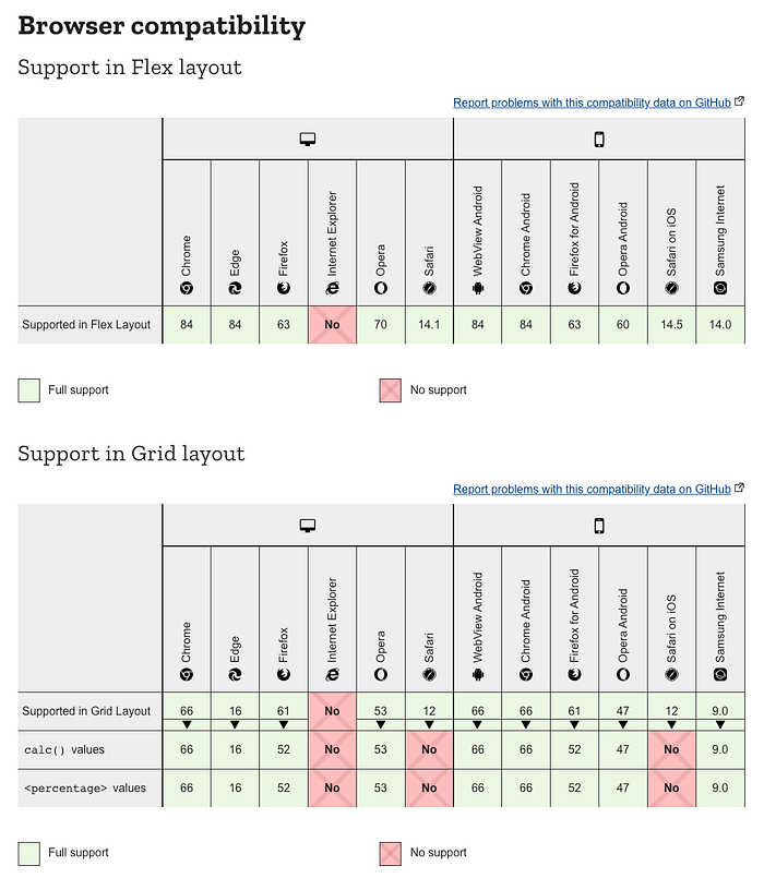
Why is the last one so annoying? The gap property, before iOS 14.5, was implemented only for display: grid, and since both of these properties don’t have any distinction when it comes to the name of the property, it’s not really possible to create a @supports at-rule as easily as we would’ve normally.

Since @supports not (grid: 8px) is out of the question, we’ll have to take another approach.
So how does the aforementioned selector work? Thanks to some googling, I quickly managed to find a selector that would only target Safari on iOS.

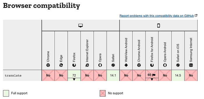
The second part was much more difficult — how do we find a property that’s only been supported since the release of Safari 14.1? A quick peek into the release notes helped — bingo, the translate property had not been supported before Safari 14.1 for both macOS and iOS was released:


Therefore, by combining these two we can create a selector that targets
- only mobile Safari
and
- devices with iOS version lower than 14.5 (Safari version lower than 14.1).
which is exactly what we were aiming for.
I enjoy this approach as well because you don’t have to write @media queries when using it, as only mobile Safari is targeted thanks to the first part.
So how do we test this? Thankfully, we have Browserstack. It’s an amazing tool that lets you simulate the behaviour of various browsers on many different phone models.
Let’s start with a simple example — three divs of 30% width separated by a 5% width gap. I set the background-color to #cde9c5 so that the gap is visible.

How will it work on a Safari 14/13 device though?

As we can see, the gap is not there, and therefore the divs took 90% of the space, and the remaining 10% is green. How do we fix this then?
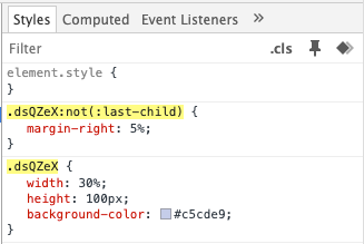
By providing a 5% margin-right to each but the last child, we managed to overcome the problem.

As we can see after inspecting the elements, the extra at-rule was applied.

As expected, devices that support flex-gap will not see this rule.

I hope this article helps you facilitate the process of supporting Safari below 14.1. Other solutions out there mostly demand using JS, and I find using CSS to handle such problems a more consistent technique, as we’re taking care of styling problems in the exact place where they should be managed.
P.S. The example above was done using styled-components. If you want to use the @supports syntax with CSS try this article.
